Does it take ages to answer regular simple questions about your business performance because you’re wading through data? Are canned reports too inflexible to provide the answers you need? Are specialized business intelligence tools too complicated to use and integrate? Now, with Insightly’s custom reports, you can use charts and graphs to easily answer questions about your business. Not only can you answer questions about your opportunities, tasks, leads, contacts and organizations, but also projects. So, you’ll always be able to stay on top of the health of your business effortlessly.
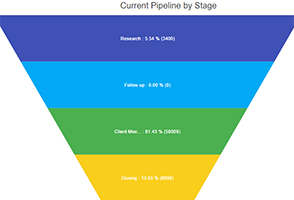
For example, a line chart can easily tell you how well your business is converting leads by month. Or, a funnel chart can tell you how many opportunities are in a each stage and the aggregate value of those opportunities in each stage. (See below.) Once you know the patterns in your key business metrics, you can quickly take action to make sure business is moving in the right direction.

Measuring your business performance is just as important as managing your business. And, it’s crucial to keep a good balance between the two. If you spend too much time managing your business, but not measuring it, then you can easily get sidetracked. With Insightly’s Custom Reports with Charts, you can quickly and easily get answers about your business so you can remain focused on the priorities that improve your business.
The tutorial video below explains how you can get started with Insightly’s charts in custom reports. Or, if you prefer, you can learn more about it in our help article.
And, we’ve saved the best news for last. This feature is available on ALL plans – including our free plan. So, you can visualize your business data at no additional cost.
If you like this update, be sure to share and like this post on social media!